

What is Mobile User Experience (UX) Design?
Mobile UX design is the design of user experiences for hand-held and wearable devices. Designers create solutions (typically applications) to meet mobile users’ unique requirements and restrictions. Designers focus on accessibility, discoverability and efficiency to optimize on-the-go interactive experiences.
Catering to Moving Users
The importance of mobile UX design grew dramatically in 2014. Designers had targeted desktop users as the mainstream, but mobile users suddenly became the online majority. These users have unique needs. They don’t have miniaturized desktop experiences or any of the advantages desktop users enjoy. So, we must create designs where we make the best use of smaller screens and cater to human physical limitations such as fingertip size. We also tailor experiences to match mobile environments. Attention spans are short in mobile UX. Users want results fast, with minimal effort and zero friction. They’re often distracted. Signal and power loss are frequent worries. These users often walk while thumbing devices in potentially dangerous settings – for instance, to explain they’ll be late for work from a train station. Typically, mobile users find themselves in three scenarios:
- Microtasking– they use devices in short, intense spurts – e.g., to buy tickets.
- Local– they use devices to see what’s happening around them.
- Bored– e.g., they surf newsfeed links while waiting.
How to Streamline Experiences for Users On the Go
When you design for mobile, you must first decide whether to create a single design that adjusts to all devices or several versions tailor-made for screens of various sizes. The first type is responsive design. The second is adaptive design. You usually design for the smallest device, working upwards (smartphones to tablets, etc.). You should follow web standards (W3C’s) and support as many browser types as possible. It’s important to focus on context, convenience, conciseness and consistency. You should use a less-is-more approach. So, you’ll need to choose carefully which features are vital. Then, you’ll have to decide how to present them best. In any situation, users must be able to quickly find what they want, and that includes reassurance that your brand is what they expect it to be.
“Perfection is achieved when there is nothing left to take away.”
Antoine de Saint-Exupéry, writer and aviator
That means that you should:
- Minimize Content
- Design for minimal page-loading times (less than three seconds) and cognitive load. Also, 94% of mobile users use portrait mode, meaning less width to work with.
- Keep images (including embedded ones) to a minimum, and small.
- Have clear visual hierarchy.
- Use color and contrast to maximize visibility.
- Make text 11 points or larger.
- Beware of clutter – everyelement must count. Compress information into icons where appropriate.
- Calm pages and complement/frame content with whitespace.
- Include card-style design patterns to easily show actionable content.
- Ensure alldevices can support content.
- Keep page descriptions short for bookmarks.
Most users prefer to use their phone in portrait mode, so make sure you design for limited width.
- Simplify Navigation
- Most users use one hand; fingertips can be large. Therefore:
- Aim for easy-to-use, easy-to-learn/self-evident navigation. Consider progressive disclosure.
- Create 30×30-pixel/7–10-mm (minimum) buttons/tabs.
- Use full-screen navigation menus, minimum navigation levels and clear labeling, including tabs/icons and graphics.
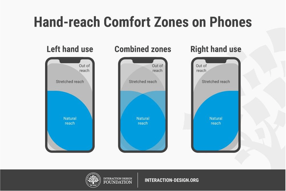
- Prioritize most-used items at the top. Consider how far users can comfortably reach.
- Give short-key access to features.
- Don’t mix navigation patterns.
- Clearly show links. Indicate when the user has activated them.
- Allow one primary action per screen.
- Restrict User Inputs
- Users become frustrated when they must continuously tap buttons. So, design to offer maximum effect for minimum interaction/effort.
- Keep URLs short.
- Pre-fill or minimize required data inputs on forms.
- Include alternative input mechanisms (e.g., voice-controlled).
- Allow permanent sign-in.
- Allow minimal, one-directional scrolling.
- Retain data in case connections fail.
- Offer obvious search features (e.g., a magnifying glass).
- Use skeleton screens to reassure that the system is executing background actions.
- Ensure Continuity and Consistency
- Let users continue where they left off and so they can switch easily between mobiles and desktops.
- Keep content consistent between screens. If you design separate versions, don’t compromise user trust with unsubtle changes.
- Maintain continuity; let users track orders, etc. just as easily on mobiles.
- If you design separate versions, let users switch from mobile to desktop formats freely.